Official Luthiers Forum! http://mowrystrings.luthiersforum.com/forum/ |
|
Cheesy? http://mowrystrings.luthiersforum.com/forum/viewtopic.php?f=10102&t=13127 |
Page 1 of 1 |
Author: | Chansen [ Tue Aug 07, 2007 6:15 pm ] |
Post subject: | |
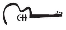
Would it be cheesy to have headstock inlay of a guitar? Yeah, well a silhouette of half a guitar... on a guitar. Hmmm. I have a friend who is in graphic design and he made a quick little sketch for me that I had in my mind but couldn't put to paper. It looks great and he even incorporated my initials without me even asking. Any thoughts? Thanks, Christian |
Author: | Arnt Rian [ Tue Aug 07, 2007 6:21 pm ] |
Post subject: | |
Well, can you post a picture? |
Author: | TonyKarol [ Tue Aug 07, 2007 11:11 pm ] |
Post subject: | |
Sheldon Schwartz logo is a guitar silhouette .. Grit Laskin did an inlay of himself building the guitar for the client ... plus another of a guy playing a guitar ... plus one of a bluesman .... Can be very tasteful IMO ... |
Author: | letseatpaste [ Tue Aug 07, 2007 11:31 pm ] |
Post subject: | |
Most of the time I think it's sort of cheesy, especially on the guitar itself. I think it sort of hits you over the head with what your brand does. It also has the potential for looking weird if you decide to build mandolins or electrics. I'm sure there are exceptions galore... I have a graphic designer friend that teaches a class at the local university, and he had one of his students design a logo for me as part of an assignment. It incorporates a guitar, and I actually like it quite a bit, but the guitar-shaped part of the logo would be easy to eliminate and still have a good logo. If I end up using it, I'll have him do one without the guitar shape so that it could be inlayed on the headstock, and maybe keep the guitar shaped one to use on a website or on the label or something. Right now, I'm a long way off from needing a logo. |
Author: | clavin [ Wed Aug 08, 2007 1:14 am ] |
Post subject: | |
You just wait I'll let you know when I'm thinking of you too... As far as cheesy goes it's all in the eye of the beholder. The most expensive painting ever sold to date is by Klimt. It's of course an awesome piece of work, but it leaves me cold. I have seen guitars inlaid on headstocks of guitars and they look great. Best maybe to work around the guitar theme- not make it literally "just" a guitar, that way it's more thematic than literal. Make it more artistic. But hey it's art, do what's in your head, not that of others. Best, Craig L |
Author: | Chansen [ Wed Aug 08, 2007 2:15 am ] |
Post subject: | |
Ok, here it is... And I switched it a little. |
Author: | Chansen [ Wed Aug 08, 2007 2:16 am ] |
Post subject: | |
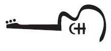
Hmmm. My first time not being able to upload. Weird. Try these links: Here and Here |
Author: | WaddyThomson [ Wed Aug 08, 2007 2:28 am ] |
Post subject: | |
Nice try Christian, but no cigar! |
Author: | Chansen [ Wed Aug 08, 2007 3:12 am ] |
Post subject: | |
HA!!!!! I did it!! Whew. It was a file issue I guess. Anyway. I flipped it the other way so the H works like the bridge. Plus on a headstock this might work better either vertical or at an angle. I am not calling this a "logo" though. Just my headstock inlay. |
Author: | WaddyThomson [ Wed Aug 08, 2007 3:18 am ] |
Post subject: | |
Third time's a charm. That looks pretty good, Christian. Nice design. They both look pretty good to me. |
Author: | Pwoolson [ Wed Aug 08, 2007 3:37 am ] |
Post subject: | |
[QUOTE=Chansen] [/QUOTE] "Cheese heads, cheese heads, rolly polly cheese heads...." that's a take off of the original Dr. Demento song "Fish Heads" Anyway, Christian, this is nothing more than my designer's eye talking. In my opinion, yes, it would look cheesy. It would almost say, "In case you couldn't tell by looking at the object, this is a guitar". But I think you, deep down, know this or you likely wouldn't have posted the question in the first place. On to the logo itself: I think you have to look at it from a "rest of the world" perspective rather than a "guitar builder" perspective. Your C and H are barely readable as letters. I understand that you are trying to make a soundhole/bridge but are you drawing a picture or trying to make a company I.D.? I would guess that unless someone knew your name, they wouldn't even see the C and H as letters. And if they know your name, why do they need a business card/etc. with your logo on it? So, and again this is MY opinion, as a marketing piece, I think it's off the mark. There are also silly little things like only having 4 tuners. I understand that the designer is going with that abstract look but if that's the case then just do the shadowed edges of six tuners. Why change the instrument? You'd be surprised at how the guitar-buying public will see these things. Like a Fender-esque headstock. If you don't want to show your actual headstock, then just hint at one with the drawing. |
Author: | Chris Oliver [ Wed Aug 08, 2007 4:14 am ] |
Post subject: | |
Christian, I think that would make a great t-shirt front.. with your name and website and something about luthier on the back. I don't think I would use it on my guitar...maybe a case sticker. I would liken it to people who get custom license plates that say what kind of car they driving. Ever seen a Toyota, Camry with 'Camry xx' on the license plates. While I admit it is amusing, I am not laughing with them. :) Of course I'm likely to inlay some image that cannot be deciphered without a long explanation, so what do I know! Good luck. |
Author: | Pwoolson [ Wed Aug 08, 2007 4:16 am ] |
Post subject: | |
Edit: I see now that you see three tuners which would split the headstock. So never mind the comment about that. Sorry, Paul |
Author: | Chansen [ Wed Aug 08, 2007 5:47 am ] |
Post subject: | |
Thanks for the input guys. A little clarification though... I will almost certainly never have a t-shirt, sticker or website. I am only on my first guitar and have absolutely no plans to make this a company logo, marketing or branding piece because I will never create a company around this hobby (even if I sold one someday). I am looking at this strictly as a cool little headstock design. Whether I use it or not remains to be seen... I still have a ways to go before adding that touch. |
Author: | LanceK [ Wed Aug 08, 2007 5:56 am ] |
Post subject: | |
Christian, I have a nice logo that is a K with a extra swoosh making it look like a guitar, I have tried it every way on a headstock and it always looks wrong. So I use it in different ways, such as an interrior tag, and also as an inlay on the end graph, or between the slots in a slot head. |
Author: | Heath Blair [ Wed Aug 08, 2007 10:35 am ] |
Post subject: | |
yeah, my first thought also was that it might look cool on a t-shirt or something similar, but on a guitar i do think it looks cheesy. and since you have no intention of having t-shirts made... |
Page 1 of 1 | All times are UTC - 5 hours |
Powered by phpBB® Forum Software © phpBB Group http://www.phpbb.com/ |